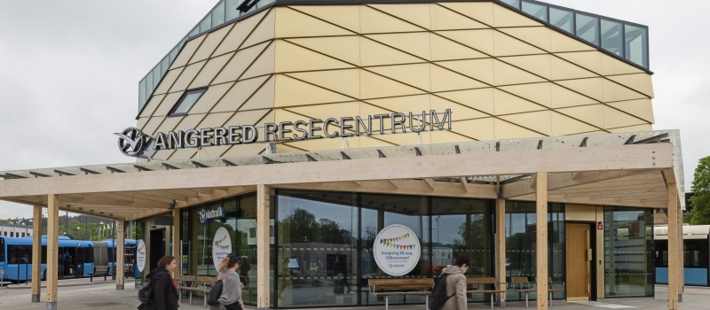
When Wingårdh was commissioned by Västtrafik to create a travel centre in Angered, they set about it conscientiously. Angered, with around 12 million annual departures and arrivals, is a major hub for Gothenburg’s public transport. The hub is used by both buses and trams. In purely architectural terms, it’s quite a diverse, fragmented location in a variety of styles.
We wanted to give Angered a jewel to be proud
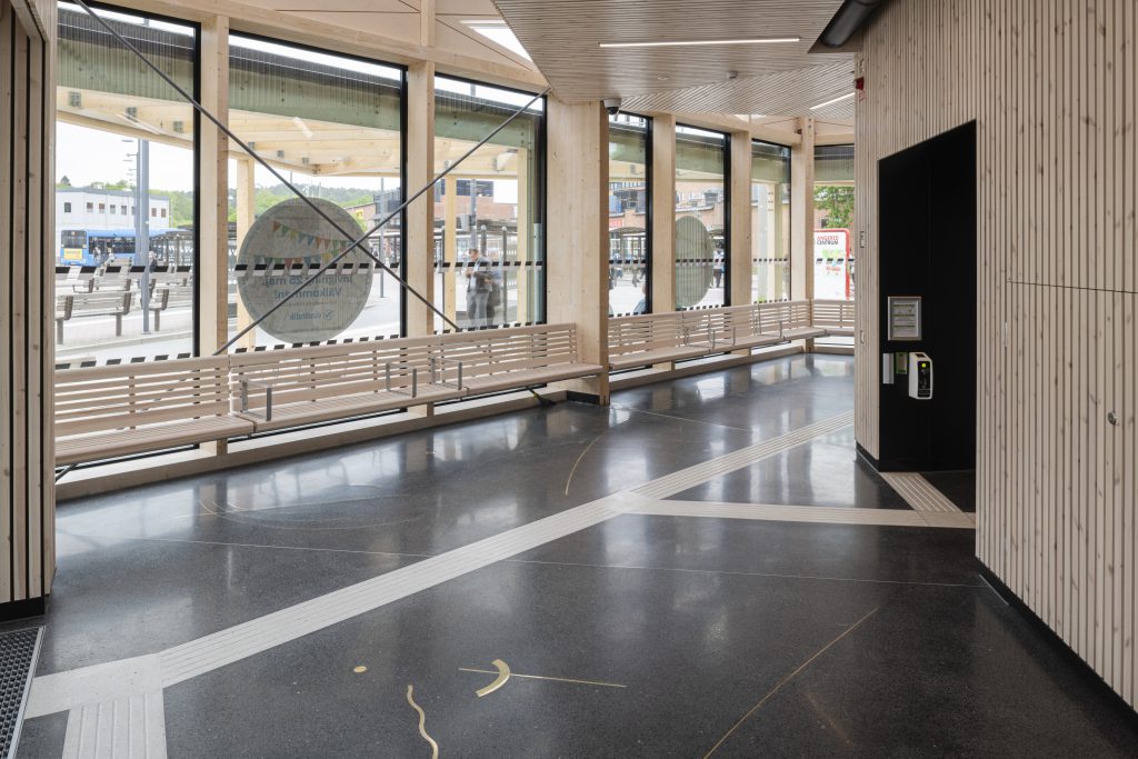
"We wanted to give Angered a jewel to be proud of,” says Ingrid Alerås, Architect SAR/MSA with Wingårdh Arkitektkontor AB. We had rewarding, fun meetings with youths from the city district, and they had a number of wishes. The building had to be safe, without unsafe corners or a rear. It also had to enhance the existing thoroughfares, and their meeting place had to be preserved!"It was a great design process that resulted in a travel centre with two stories and five corners – a pentagon. Inauguration was on 25 May 2019. Upstairs there are rest areas for public transport drivers. The ground floor houses the arrivals and departures hall, conveniences, the Västtrafik store and the Pressbyrån kiosk. Also, the entrance level, with its glass outer walls, is entirely transparent and enables a clear view through to all five corners.
Dark grey terrazzo and shimmering brass
The travel centre is built largely from natural materials. It has a glulam frame, and pale wood also place a prominent part elsewhere. The floor is made from terrazzo in various shades of dark grey, and they decided to allow the inclusion of one additional type of material. Because the building was a municipal project, it also included artistic embellishment, and Wingårdh wanted this to be part of the design expression, and not an afterthought. A competition was announced, and many artists expressed an interest. Caroline Bäckman was the successful competition finalist.
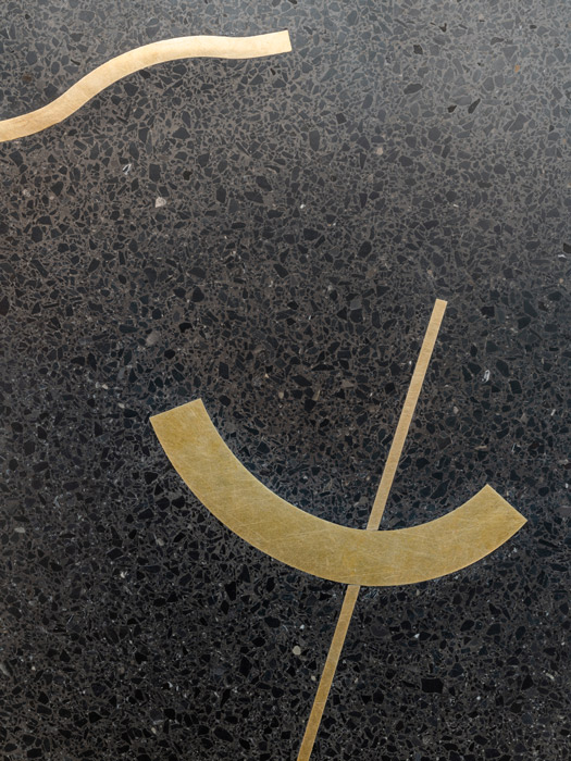
Caroline’s proposal was based on embedded brass in the floor, brass door handles and printed, graphic patterns in the protruding glass roof that runs around the entire building. The latter provides shelter from the weather while its patterns not only act as sunshades but also create playful dappled light on the floor.

Forms that capture movement
Caroline is a trained jeweller and brass is a material close to her heart.
"I love the colour of brass and the material reflects light so beautifully,” says Caroline. “It also goes together well with the terrazzo’s dark shades of grey and the wood in the building. Brass is also included in the outer walls."Every day, many people will pass through Angered’s travel centre. Bodies moving through a space form circles, squares, triangles, swirls and lines. These are the patterns and rhythms we tried to capture in the design of the terrazzo floor’s embedded brass. In this way, the interaction between people and material can add another dimension to a space.
Herrljunga Terrazzo, Ingrid Alerås and Caroline Bäckman were in touch with each other at an early stage, which led to an efficient working method that enabled them to raise the right questions and deal with any problems in good time. They also enjoyed excellent collaboration with Västtrafik and the builders at K21 Entreprenad.
Practical terrazzo in a floating structure
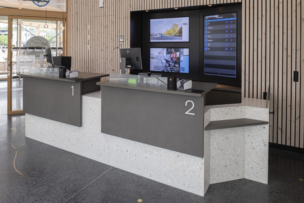
Terrazzo was selected for several reasons – it’s durable, easily maintained and easily cleaned. It has no particular direction, which is a clear advantage in a building with five corners. In principle, there are infinite possibilities when it comes to colour and design, and its also possible to add other materials, as was the case here. The structure in Angered is also based on a so-called floating floor where the concrete layer and terrazzo rest on a sliding layer, which makes the floor flexible and less sensitive to movement and temperature differences. Terrazzo was also used for the reception desk, whose colours harmonize with the walkways, which also have routed, tactile grooves.
Ingrid and her colleagues enjoyed many rewarding contacts with Herrljunga Terrazzo during the project.
"Herrljunga Terrazzo is a truly reliable, skilled and experienced company. We enjoyed great cooperation. As architects, we can be a little bit finicky and have fixed views. But there was never a problem – they always met our needs. If we wanted to change something, they listened and showed great understanding. They came up with unique concepts for our terrazzo, fully in-line with our wishes, and we are extremely satisfied” concludes Ingrid."